Public Theater
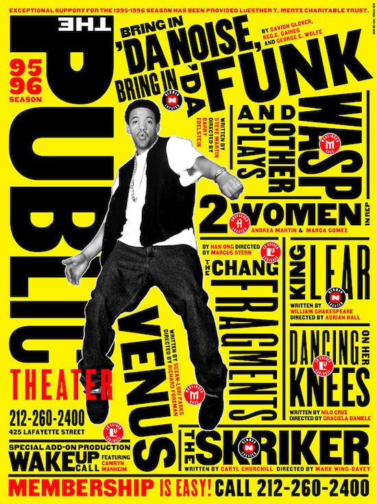
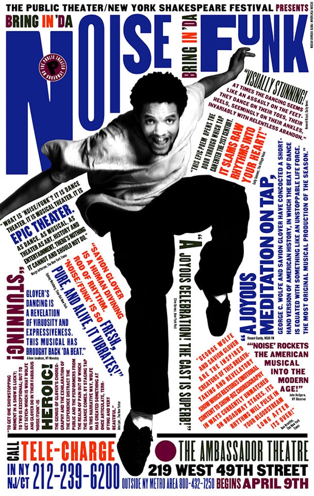
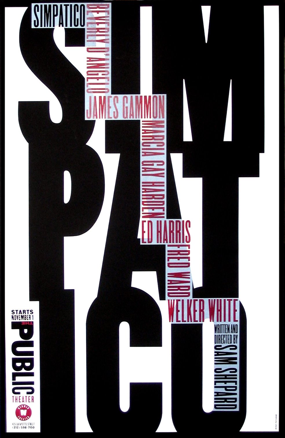
Paula Scher was very involved with the Public Theater group. She had created many posters for them over the years showing her skills. The first two of which were groundbreaking because it set a new bar for typography of the 1990s. Using
unorthodox spacing, mixing font colors and weights, and employing uncommon and often historic typefaces, Scher's text-heavy poster presents a large amount of information in a dynamic and expressive way. Fusing highbrow and lowbrow, this
eclectic and irreverent approach signals Scher's affiliation with the New Wave graphic designers of the 1980s and 1990s, who rejected modernism's neat grid and cool affect. Scher's identity for the Public Theater places emphasis on the
word "public" to position the institution as an affordable and accessible venue for all. For the last poster, Scher created it for the New York Shakespeare Festival in Central Park production of The Merry Wives of Windsor and Two
Gentlemen of Verona. It borrowed from the tradition of old-fashioned English theater style. This laid the foundation for the new overall identity and visual language that came to define the Public Theater for the rest of the decade and
beyond. The designs for the Shakespeare in the Park campaign went all across New York, like the buses, subways, kiosks, and billboards.